THE BEACH BARN
Alex Fulton and I have been friends for over 14 years - bonded through our love for design, art and forging career pathways that weren’t always easily defined!
It was with excitement that I watched Alex and her husband Jeff transform their esplanade home into an award-winning renovation. Always one to walk to the beat of her own drum, Alex has a distinctive and detailed approach to design that has rightfully earned her accolades.
As my own passion for design veered off into garden land, I was thoroughly intrigued with the angle she would take in addressing her coastal plot. As an experienced interior designer, she knew her limitations in plant knowledge but the visual outcome lived clear as a bell in her mind’s eye - she just needed to find the right designer to hold her hand and lead her there.
The resulting garden (still in its infancy) is a collision of styles that reflect the Fulton aesthetic. Coastal with desert vibes, urban with a borrowed landscape of sea and rural hillsides, design-led but distinctly functional (bar the new puppy which has been ripping up plants and forged a race track through the ground cover!
Thus is life!)
For me, this garden represents the magic of personal style - creating spaces that please you and not holding back! This type of garden might not appeal to everyone, but that’s the real treasure of owning some ground of your own and wholeheartedly chasing the potential that comes with it.
Enjoy a view through this distinctly different garden.
Photographs by Julia Atkinson-Dunn
Words by Alex Fulton and Henry Blakely.
Garden profile
GARDEN: The Beach Barn
LOCATION: Sumner beach, Christchurch
SIZE: 350 sqm
ENVIRONMENT: A narrow garden directly across the road from the beach. Free-draining sandy soil, prevailing easterly winds, all day sun - firstly through the front garden then landing out the back in the afternoon.
Homeowner - @helloalexfulton
Property - @afdbeachbarn
Designer - @henryblakleylandscapes
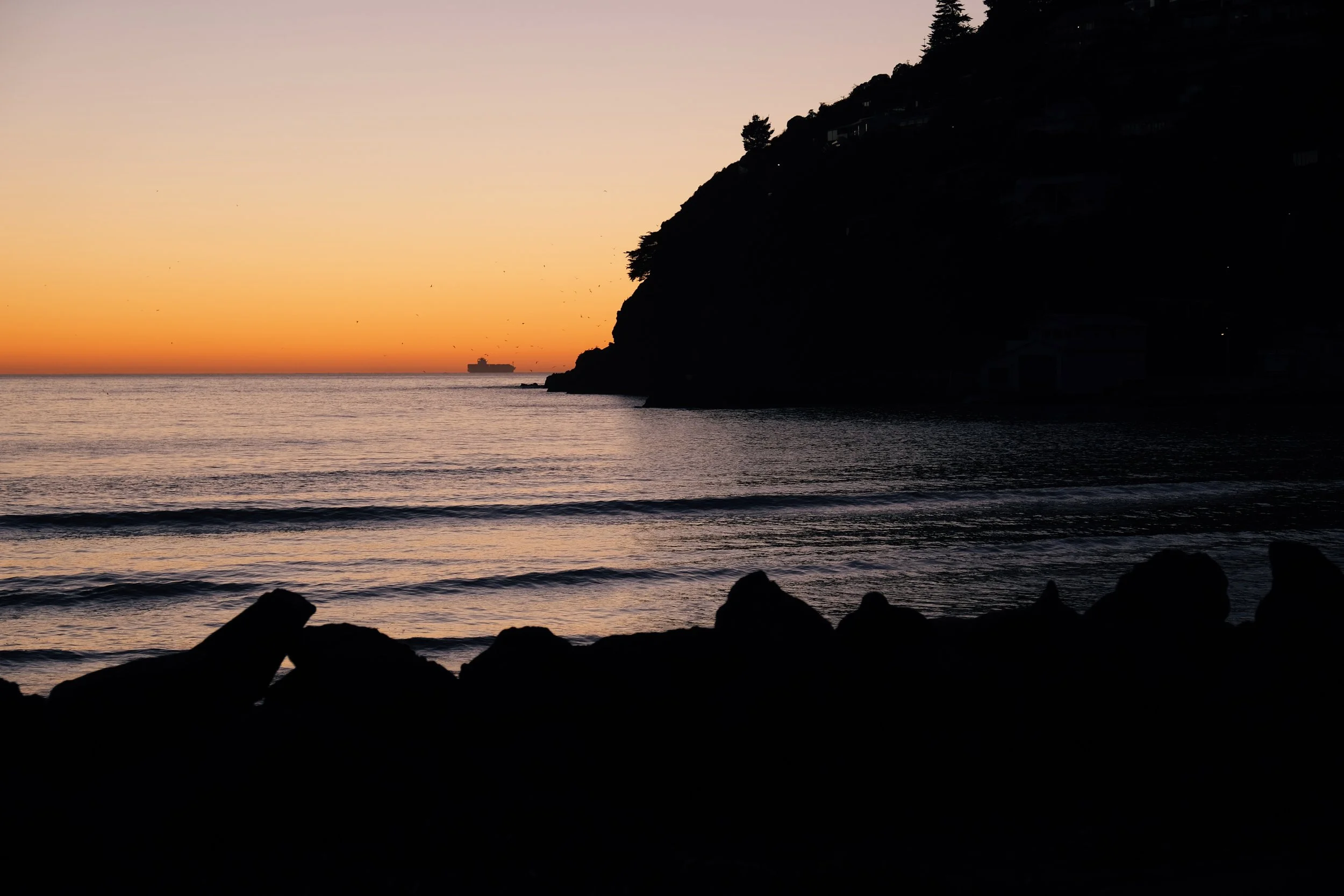
Iconic Cave Rock of Sumner beach with the snowy Southern Alps in the distance.
ALEX : Gardening is not a 'thing' for me - I am an interior designer by trade but really liked the idea of designing the garden just as I would an interior space. The same challenges apply as you consider function, flow, design, colour and layout. There may not be a ceiling but there are still walls, lighting and furniture to consider so I didn't feel too out of my depth except for when it came to plants, now that's an area that I felt was very foreign for me!
Luckily we had Henry Blakely Landscapes.
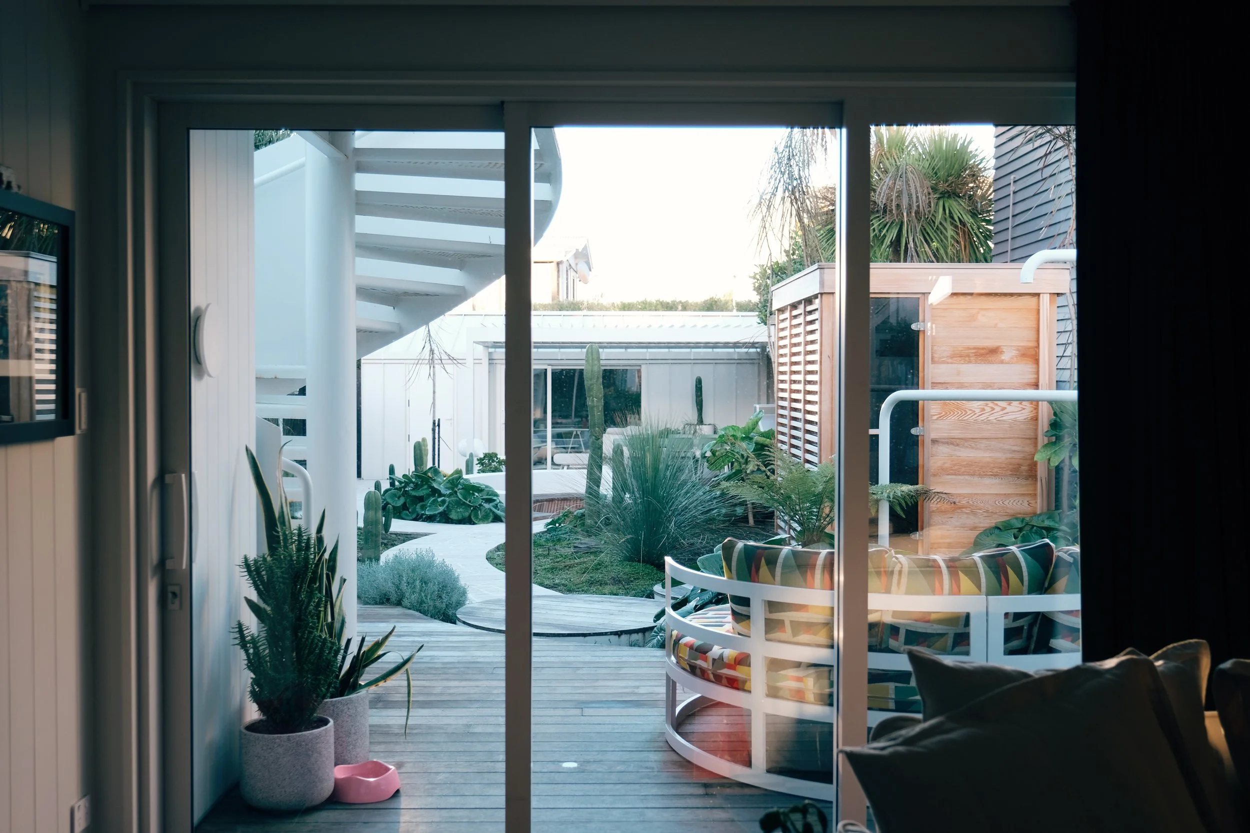
Our garden consists of two distinct areas - front and back, with a side path connecting the two. Like a design for an interior, I really wanted each space to work with our needs and how we live. I also wanted to reference the curve of the exterior spiral staircase that has such a strong presence in the back space.
We wanted outdoor seating, clear pathways, interesting foliage, no flowers, no lawn, a hot tub, a sauna, an outdoor dining area and an outdoor pizza oven. We wanted to extend our living from the inside to the outside.
Before our renovation we lived in this house for 4 years and it gave us plenty of time to see how we live as a family and what our needs were and will be. Our daughters were starting high school when we moved in and would have left home by the time we are fully finished.
THE FRONT GARDEN
New Zealand native cloud pruned tōtara act as living sculptural elements.
New Zealand native Selliera radicans ground cover
Clever and convenient storage and screening has been created at every opportunity.
The entrance to the house beyond the protective solid front walls and gate.
New Zealand natives Griselinia littoralis (kapuka) on the left and Meryta sinclairii (puka)
ALEX : Our first garden design had to be completed for the building consent process which I found very backward as I wasn't really ready to commit to what we needed but that was just what the council required. Fair to say that the landscaping changed quite a lot including ditching the above-ground idea of the pool. We ended up scrapping that idea as it was getting too expensive, it was taking up too much space (the back garden is very long and thin) and we had a huge pool out the front of the house (the sea!).
As we neared the end of the renovation we got Henry onboard to start the landscaping process. The first stage was getting the front completed so we had street appeal and a sense of the garden connection to the house. We also had two dogs and we needed one of the outdoor spaces to not be a dirt/mud pit! Not the best combination - a newly renovated house and muddy dog feet.
Our brief to Henry was for plants that were always green, had interesting forms, were mostly native, hardy for the seaside environment and required not much weeding. We also really wanted the garden to be very precise - confined to hardscaped areas that complemented the architectural details of the house. This meant planning walls, decking, lighting and plants that softened spaces as well as adding unusual forms and shapes.
I think we asked for a Palm Springs/Japanese/Balinese vibe! He didn't disappoint.
THE SIDE GARDEN
Meryta sinclairii (puka)
Ficus pumila spreads across the wall down the narrow side path.
Above and below : The cloud-pruned tōtara viewed from the side passage and large indoor window.
CONSIDERATIONS
ALEX : We really left this in Henry's capable hands. We had total trust as we really didn't know many plants - we knew we liked big green leaves, succulents, natives and cloud trees. That was about the extent of our garden knowledge. We also had some established cabbage trees, pukkas and olive trees which were a must stay so needed to be included into the final plan.
HENRY : Aside from the obvious wind, sun and salt that comes with a coastal site like this, the soil was sandy with little organic matter and very free draining which needed a lot of improvement for a garden like this to flourish. The frost-free location did give us the opportunity to use a variety of plants you won’t often see in Christchurch.
The narrow section with little setback from the busy beachfront street, and the family’s lifestyle required that all the outdoor spaces had to work very hard to deliver lots of functionality, privacy, security, and utility at an aesthetic standard that was complementary to the architecture and Alex’s wonderful interiors.
FRONT GARDEN
The front garden is defined by its rectilinear blockwork forms which carefully delineate its different areas. On one boundary you have a utility area consisting of an outdoor shower, surfboard rack and bin storage with its own street access whilst on the other boundary you have the main pedestrian entrance and boardwalk to the front door. Between these two areas you then have a third private deck area of a ground floor bedroom. All these distinct areas had to be thoughtfully separated to perform their individual functions whilst also serving as a viewing garden from the first-floor balcony.
The built forms of the front garden are softened by its informal planting and a palette that connects it to the rest of the gardens.
REAR GARDEN
In contrast to the front garden, Alex wanted the rear garden to be almost entirely curved lines and circular forms - likely taking its formal cues from the spiral staircase at the back of the house. We developed a concept for the rear garden from Alex’s initial sketch.
Once again, the space had to work very hard to accommodate three separate living spaces. We leaned more into the Palm Springs aesthetic with the addition of sandstone crazy paving and expanded on the established planting palette from the front garden.
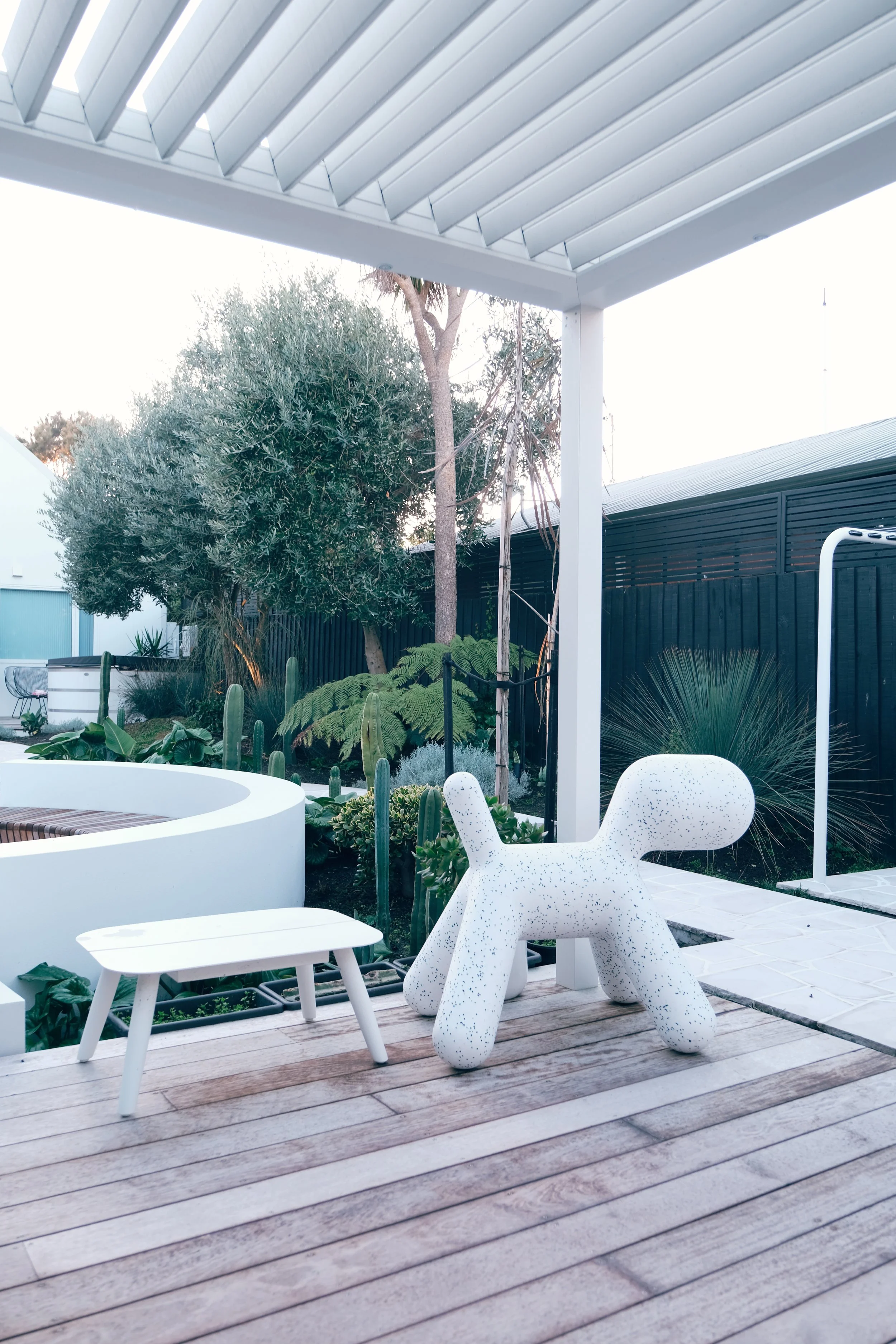
The centrepiece of the garden is the circular sunken conversation pit that seamlessly connects to the backyard studio and outdoor dining.
SHOWER AND SAUNA AREA
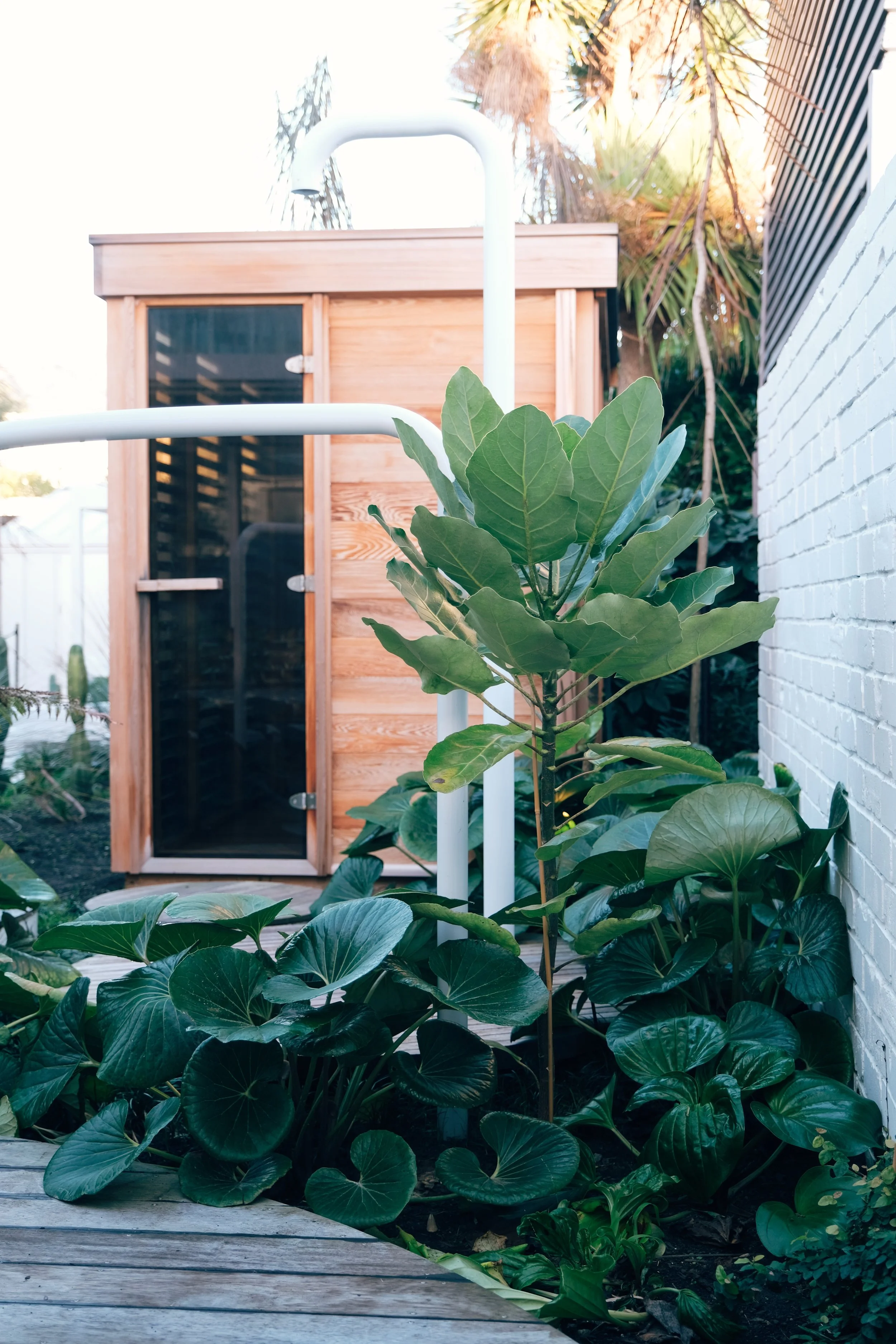
The very cleverly designed outside shower and sauna. Easily accessible from the side pathway for those returning directly from the beach.
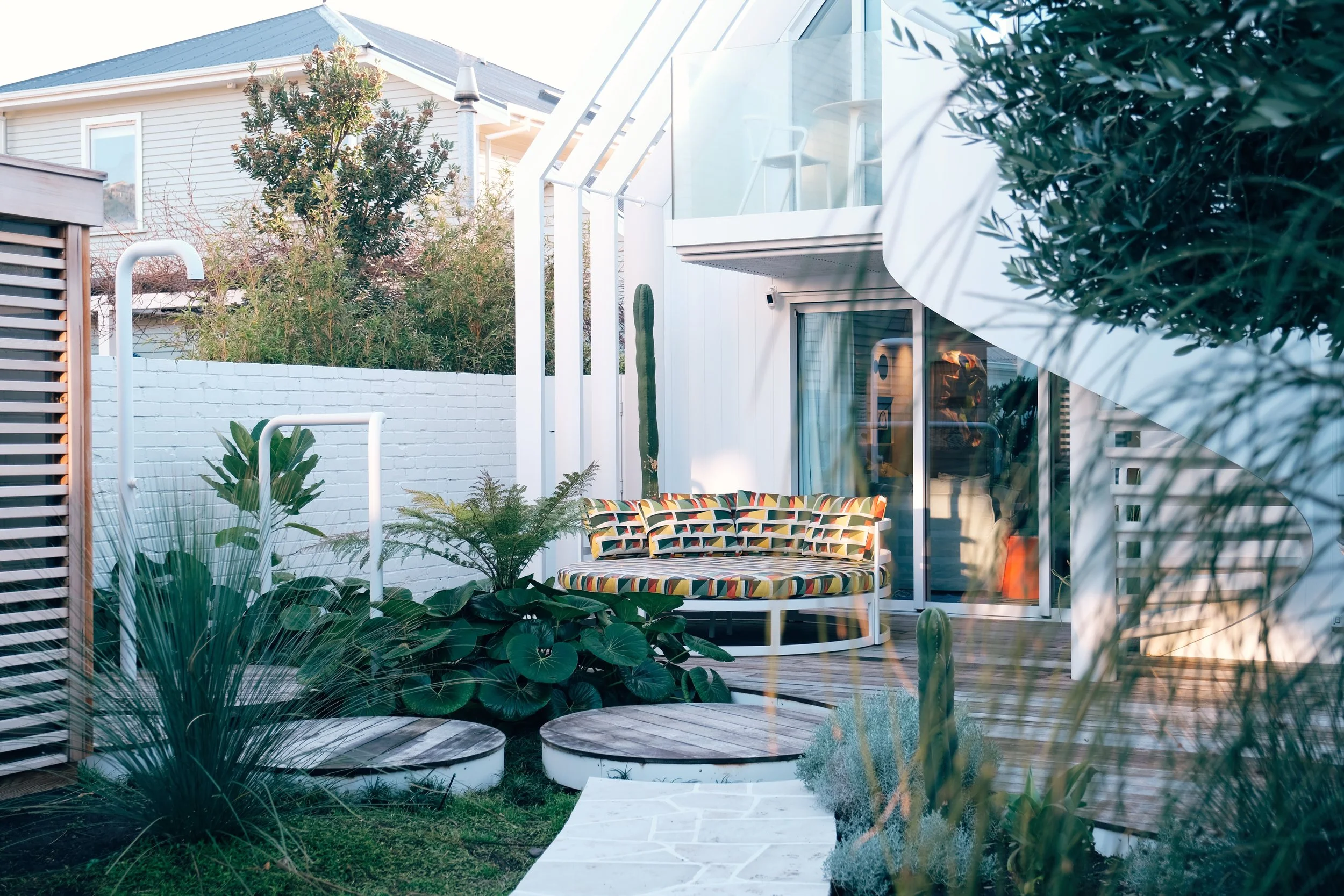
Curves through the furniture and garden reflect the spiral staircase at the back of the house. The outdoor lounger was purchased from Bunnings, powder-coated white and reupholstered.
Ligularia reniformis (tracter seat plant)
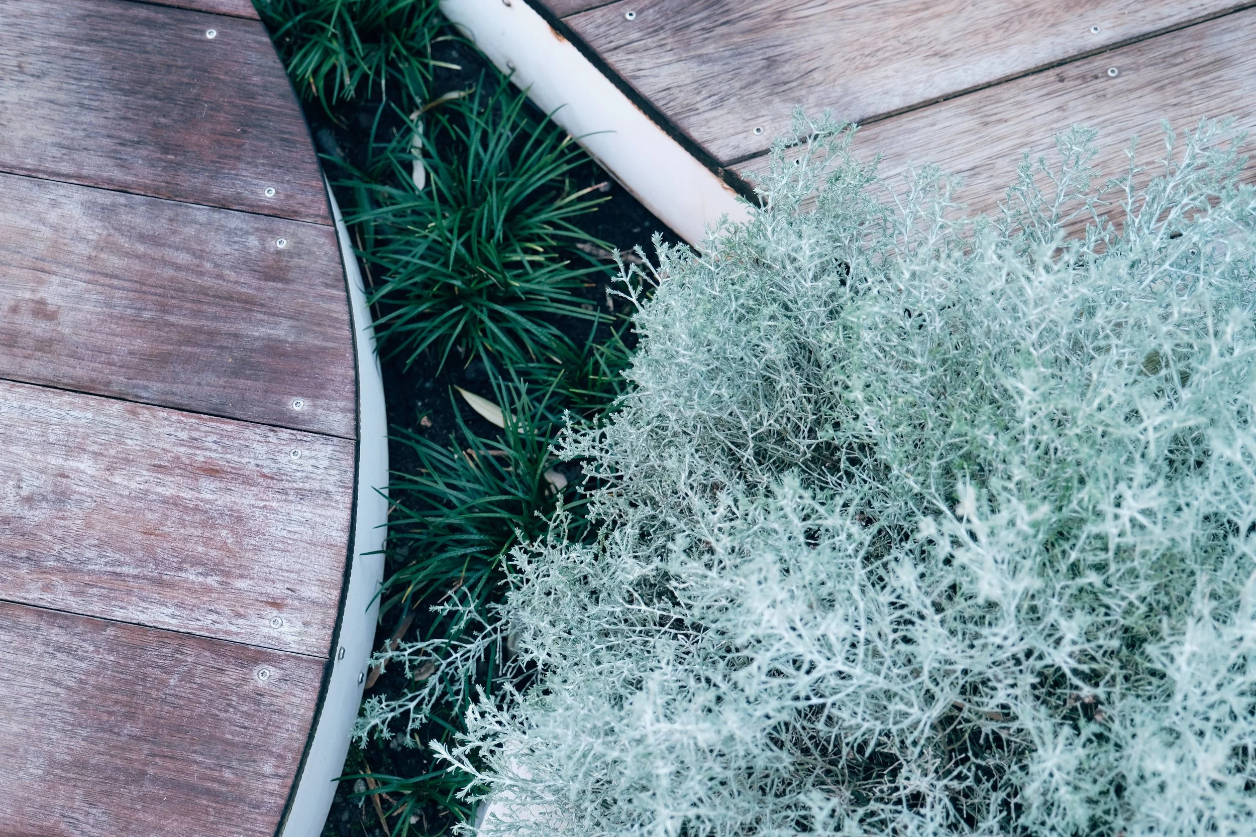
Silver Calocephalus brownii (silver bush) is used to great effect.
All the San Pedro cacti were cultivated by Alex.
ENGAGING A DESIGNER
ALEX : We wouldn't have tackled this project without a professional designer as we would have been going in blind - I'm sure there would have been a lot of trial and error so by getting it right the first time we have saved on time, effort and money. Just like engaging an Interior Designer for your home is important to get it right! We were really clear about how we wanted it to all look but didn't know how to get there!
We made sure we had lots of images for Henry to reference too and that's how we started.
THE BACK GARDEN
Light-toned crazy paving and further curves connect the main house to the studio and sunken seating area designed by Alex.
Existing olive and cabbage trees meld with ease into the lower planting.
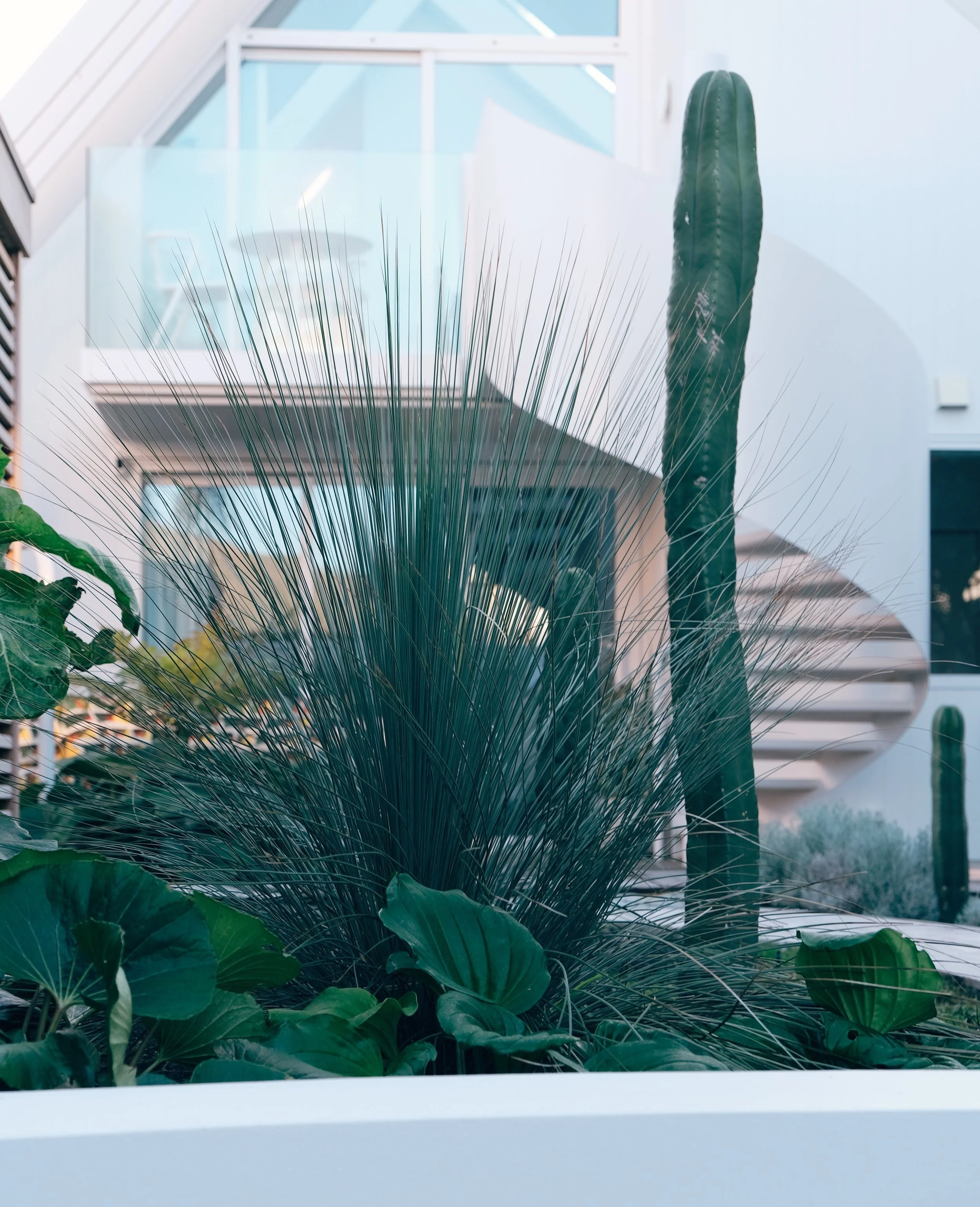
Gorgeous strong Xanthorrhoea glauca (Australian grass tree) was a stand out for me! While a delightfully sized grass now, it will slowly grow (1-2 cm a year) a thick trunk (often multi-stemmed) to reach a mature height of 4m. A fantastical looking result!
The washing line was another custom design by Alex (as was the shower rail) and made by the same steel worker who created the rail on the spiral staircase. Another Xanthorrhoea glauca (Australian grass tree) sits beside it.
Curves vs straight lines, smooth monochromatic colours vs textural shades of green and hard vs soft materials create appealing juxtaposition and atmosphere.
The Fulton oasis.
FAVOURITE PLANTS + DESIGN
ALEX : We love the low large leafy ground dwelling plants Ligularia reniformis (tractor seats), the San Pedro cacti (that I grew myself over the past 10 years), the established Pseudopanax crassifolius (Lancewoods) that were planted around the back, plus the native ferns dotted about and cloud-pruned tōtara trees - Podocarpus totara ‘Matapouri Blue’. Also, the creeping Selliera radicans gives us year-round green ground cover that looks lush and dense.
HENRY : The sun-drenched, bright white, modern architectural forms of the house are reminiscent of mid-century Palms Springs architecture. One of the most iconic features of that Palm Springs style is the combination of robust desert plants like succulents and cacti with lush elements like palm trees, lawns, and hedges.
This Palm Springs aesthetic mixed with a bit of Balinese jungle, together with the existing plant palette of puka, cabbage trees and Alex’s San Pedro cacti is the basis for the planting design.
With these influences in mind, we have used a variety of native tree ferns, cabbage trees and lancewood as stand-ins for palm trees. Secondly, we then have more arid plants like the San Pedro cacti, Australian grass trees and a variety of succulents. Thirdly, we have leafy plants like the puka, Ligularia reniformis, griselinia hedging and mass underplanting of ground cover plants like Selliera radicans and mondo grass.
Part of Alex’s brief was that the colour palette of the planting be limited to green, with foliage, not flowers being the focus. In response, we have used the interplay of different foliar forms, textures, and topiary to create interest. We used plants like Calocephalus brownii and tōtara ‘Matapouri Blue’ cloud trees to introduce a contrasting glaucus hue at different points throughout the garden whilst also referencing the established olive trees.
Australian Grass tree (Xanthorrhoea glauca)
Slightly glaucas coloured foliage and architectural form make this plant a stand out in this garden.
Wheki-ponga (Dicksonia fibrosa)
We think it’s best of the native tree ferns. Hardy and prehistoric looking with elegant form and proportions.
Puka (Meryta sinclairii)
We love the way the large glossy green leaves bring a bit of the Balinese jungle to this garden, particularly along the boardwalk to the front door.
San Pedro cacti (Echinops pachanoi)
These bring just the right amount of Palm Springs to the garden. They look great rising skyward through the underplanting. We can’t wait to see how these form larger clumps in the next 5 years or so.
INSIDE TO OUT
INSPIRATION
Most of the inspiration we got from the garden was from Pinterest - there was one particular garden which ticked so many boxes - a house based in Parkhurst, Johannesburg and was featured in Homestyle Magazine.
We just pinned and pinned and eventually, we could see common themes that we could then talk to our designer about and eventually make a plan.
This collecting of images to find an emerging theme is advice I regularly give to my clients to help hone in on a style and vision for a project - it worked well for landscaping too. Henry also has some pretty impressive images of jobs he's done over the years too.


